
Trans Semarang App

Semarang, Central Java, Indonesia
2009
Bus Rapid Trans
33.000-36.000 (2019)
1.000+
Challenge
The app had a cluttered interface, making it difficult for users to navigate and find essential features. Users were facing issues with the onboarding process, which was affecting new user adoption rates. The app lacked personalization and customization options, making it less engaging and user-friendly.
Results
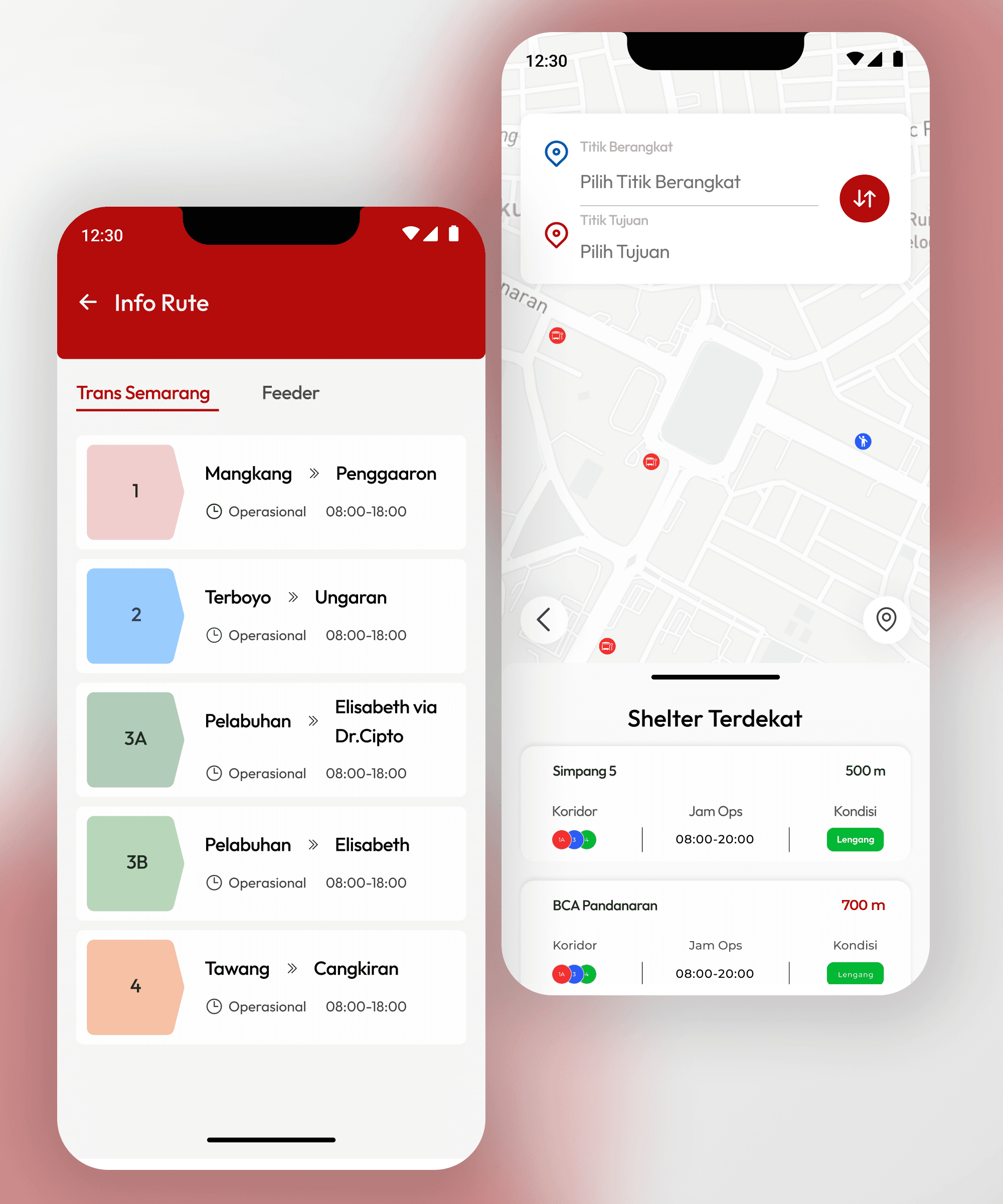
The redesigned app features a clean, clutter-free interface, making it easier for users to navigate and access essential features.


Process
Research & Analysis: We conducted user interviews, surveys, and analyzed in-app analytics to understand the pain points and user needs. We also studied competitor apps and industry trends to gather insights
Information Architecture: Based on the research findings, we restructured the app's navigation and content, prioritizing features and information according to user needs.
Wireframing & Prototyping: We designed low-fidelity wireframes to visualize the new layout and navigation, iteratively refining them based on user feedback. Afterward, we built a high-fidelity, interactive prototype to test the design.


Conclusion
I hope the redesign of the Trans Semarang mobile app successfully addresses usability issues, resulting in a more intuitive and user-friendly experience. I also hope that the improved UX/UI design will increase adoption, engagement, and satisfaction for users, making Trans Semarang even more helpful for the people of Semarang